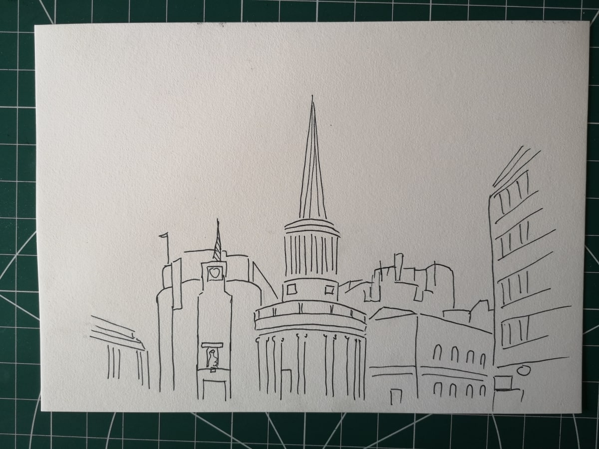
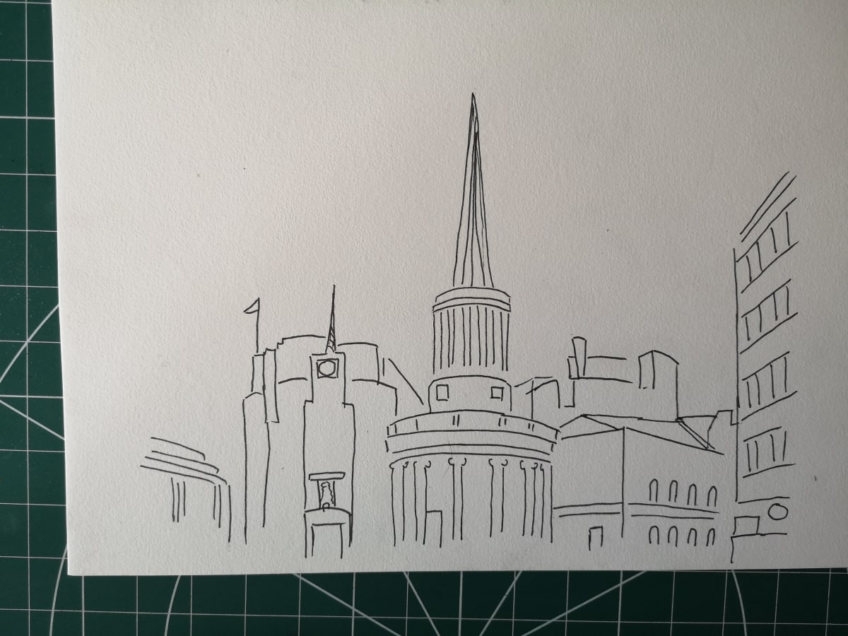
OCA Drawing Skills, Expanse, Project 5, Exercise 3
As previously discussed in the preliminary study for this exercise, the goal for these pieces was to create a sketch of an urban landscape using just three colours.
I chose to draw this using Copic alcohol markers for a deep saturation of colour and washes of Indian ink.
After exploring colour choices in my preliminary study I consciously chose a mustard yellow colour to represent the sandstone of the church in the image, blue for the buildings to the side to show the blue shift of colour as subjects recede into the distance and then green for broadcasting house as this is a mix of these two colours.

I was going to go for a blue sky, but actually the sky was a faded out white/grey that London is known for and the off white of the paper suited this really well.
I deliberately chose to add touches of blue on the church clock, yellow behind the building on the right and green for the round sign as this added touches of each of these colours across the page and made it feel less broken up and more integrated. These touches of colour also help to move the eye around the page as they stood out more.
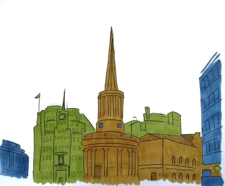
I ensured I drew strong verticals, which this particular scene helped with as the spire, antenna and tall buildings to the right gave this sense of height.
The diagonals I drew helped show perspective and showed how the buildings receded off to the distance or entered the page. The angles of the spire also added additional diagonal interest.
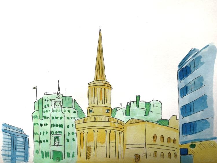
With the ink washes I gradually built up deeper depth of colours to give that stronger sense of line and depth. This tonal variation was a little harder to achieve with the Copics.
I feel I was able to get a good sense of perspective and depth and the green building really feels as if it is situated behind the church (which it was).
I enjoyed the restriction of using three colours and I particularly like the boldness of the alcohol markers. The washes of ink allowed me to get more nuance in the picture and whilst this picture is lighter overall, it still has a certain solidity to it.
I am also pleased that I chose to go over the image with a very fine fineliner pen afterwards to add in detail and give it a richer feel.
This was enjoyable and the two studies in different media helped me grasp the concepts of colour use to create depth in a work.
References:
Sturley, A (2021) https://sturleyart.wordpress.com/2021/05/31/a-limited-palette-study-preliminary-study/ (accessed 11.06.21)
